Can my bank’s interface excite me? Can paying bills become less of a drag?
BillDesk is a premiere Indian online payment company. If you buy things online in India, if you’ve paid bills through netbanking, or if you’ve selected your payment options on an Indian vendors’ website, you’ve used Billdesk.

I was a part of the FOLO team that reimagined the net- banking interface for several major Indian Banks that use Billdesk. Apart from working partly on the visual design, I was primarily concerned with the look and feel of the product.

I came up with first set of payable commodities for the interface that were slightly pictographic and in line with the devised colour scheme. Billdesk is a backend payment framework for the banks to integrate in their online products. The interface facilitates payment of bills of various kinds.

I took the orange colour from the existing ideate to come up with the colours for the pictographs


Extended use of the motifs in illustrations. As it's a bank interface and Billdesk portals are used on 2G internet in some places, the interface had to be super light. Using flat colours and vector artworks made sense to help the fast page loads.

We also made a secondary set of iconography for the banks that might prefer a line- art approach instead of a pictogram. This is a Visualisation for Standard Charted bank.


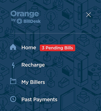
We wanted to make the interface layered with interesting visual elements. We used a tessellation of the commodities in the hamburger menu as a backdrop.


